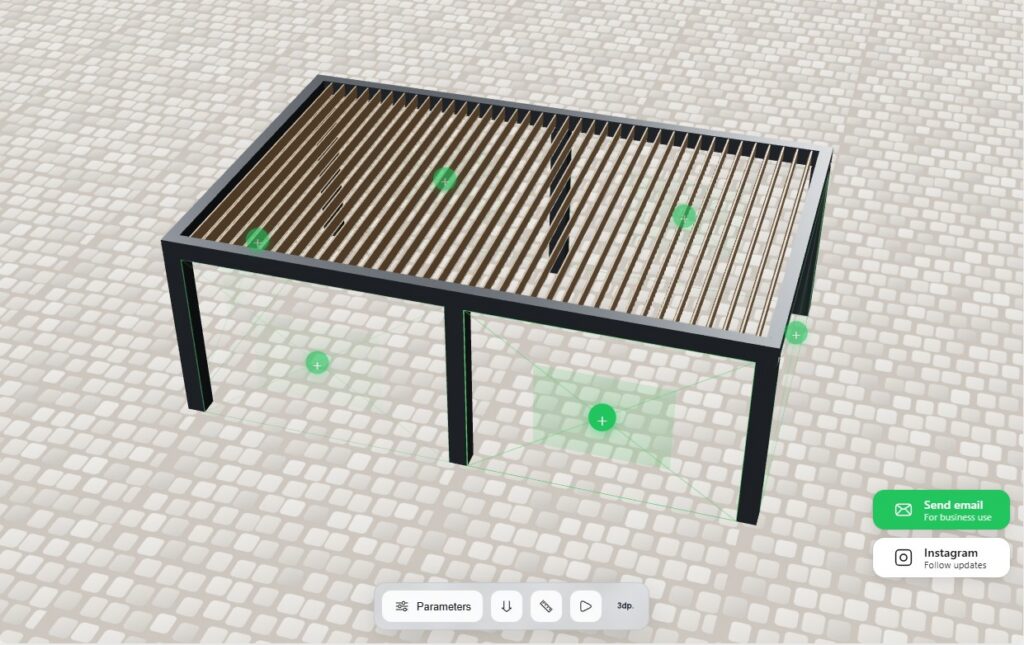
Early in 2026 I set up interactive blocks on a carport maker’s website — instead of cards with photos, people could actually mess around with the product right on the page. The bet was cleaner leads: that’s what quiz forms are for, right? Leads came in, and some of them did go through those new blocks. But a chunk of people just kept calling and writing through the old form, like they never noticed the interactive part at all.
What caught my attention wasn’t which form “won.” It was who stood behind those two paths. Why one person builds the thing themselves and another grabs the phone right away. And the longer I watched, the clearer it got: these are two different buyers, and they show up on the page for different reasons. A good page carries both. A bad one loses one of them — usually the bigger group.
Let me be straight: I didn’t run an A/B test, and I’m not going to tell you interactive lifted conversion by some number. But something else changed in the leads. The people who came through the interactive block already named their size, color, options. The callers usually had their request worked out in their head. That’s what got me thinking — we’re not comparing two interfaces, we’re comparing two ways of buying. What follows is what I made of it. No “do this and win” recipes; just thinking out loud, with the numbers I could dig up.
Traffic isn’t a sale yet
Start with the obvious. You pay to get the person there. Ads, SEO, now even showing up in AI answers — all of it brings them to the page. And that’s where the paid part ends. What decides things next isn’t traffic, it’s the first few seconds on the page.
Someone opens a product page, runs their eyes over it, reads a line — and leaves. The product’s fine. The page just asks them to read and look, while they still haven’t figured out whether this is even their thing.
Two buyers you can easily mistake for one
That’s where I landed, staring at those two paths. Two very different people show up on the page.
The first one knows what he wants. Model, size, rough price — already in his head. He’s here to check whether you’ve got it, and to size you up against the competitor in the next tab. From there it comes down to simple stuff: is the site pleasant, do you have the model, is the price okay, can he trust you. Interactive doesn’t do much for him — give him a solid catalog, real reviews, and an easy button. He shops with his eyes.
The second one doesn’t know what he wants. He needs a carport, but the size, the material, the options, how it’ll look in his yard — all a blur. He’s in no rush to call or leave a number, because he hasn’t figured out what to order yet. And this is the one a regular page loses — the one you actually need to help. A “request a call” button is useless here: there’s nothing to talk about yet. Maybe a consultation, if you’re lucky enough to have a sharp rep.
And there are a lot of these. Baymard pulled together fifty studies and put the average cart abandonment around 70% — seven out of ten walk away after already dropping something in the cart. And the top reason isn’t price or the form: in their survey, 42% of US shoppers bailed simply because they were “just browsing, not ready to buy.”
Often the person just isn’t ripe yet: he’s pricing it out, weighing it, talking himself into whether he needs the thing at all. So an unpaid cart isn’t always a failure of the site. It goes wrong where the site does nothing to move him from looking to deciding. Didn’t help — off he goes to figure it out somewhere else.
What people actually decide with
When you can’t touch the product, you mostly decide with your eyes. The image isn’t decoration here, it’s the backbone of the choice. PowerReviews surveyed over 15,000 Americans: 91% are more likely to buy when reviews include photos and videos from other buyers, and for 61% it noticeably raises how ready they are to buy.
That’s why everyone pours money into nice photos, and why people happily buy clothes off one good shot. Visuals work.
But a photo has a ceiling, and the second buyer runs straight into it. A photo shows someone else’s finished version — that pergola, that size, that color the photographer picked. And he’s looking for his own — and doesn’t find it. “How’s it going to look for me?” is a question a photo can’t answer.
Big clothing stores are rolling out AI try-on for a reason. And these, mind you, are sites people already trust and hand their number to for delivery without a second thought. The tech keeps moving, and sellers are trying to both help and make money off the service.
The experiment
Let’s try it on you.
Below is a stripped-down demo model, not a working calculator: spin it, change the colors, play with the parameters. Just to feel the difference.
Be honest: if I hadn’t asked you to play with it, would the thing have pulled you in on its own? Odds are you spent more time on it than on any paragraph above. That’s the difference between looking and doing. And it’s exactly what the research backs up, once you dig into it.
There’s a recent study out of Tilburg University (an experiment on a real retail site, 349 participants — British ones, and with one caveat I’ll get to). The finding is careful: interactive presentation is linked to a higher willingness to buy — but not for everyone, and not always. The effect showed up for individual buyers and not for business ones; it ran through the sense of product quality, and it was stronger when the item cost more. So it’s not “interactive always saves the day,” but something more precise: it matters most to a private buyer looking at an expensive thing — where a mistake costs more and a picture doesn’t tell you enough. That’s our second person. (The honest caveat: the study’s author co-owns the company whose site was used in the research. He discloses it, the work is peer-reviewed and cleared an ethics board — but worth keeping in mind.)
A gallery shows. Interactive answers.
A gallery pushes product options at you — but always someone else’s, and you flip through them in silence. Interactive lets you ask the structure your own question and see the answer right there: here’s my size, my color, here’s how it looks. A gallery leaves you a spectator. Interactive makes you a participant.
For the first buyer, a good gallery is enough. For the second, a gallery is a dead end, while interactive lets him build his own instead of staring at someone else’s — and stick around long enough to ripen.
Just don’t jump to the easy conclusion that everyone needs interactive. They don’t. Neither the research nor my own experience says so. Someone who already knows the model, size and color will do fine without a configurator — he needs quick info and a clear way to reach you. Interactive is the fix for the second buyer, not a cure-all.
On trust — and why the form scares people off
Now the less obvious part. Even once a person is ready, he’s in no hurry to leave his number. And he’s right not to be.
Everyone’s learned by now: fill in “leave your number, we’ll call you back” and you’ve opened the door to a flood of calls. It’s not paranoia. In one study of the lead ecosystem, researchers set up controlled phone numbers and email addresses to track what happens after you submit a lead form. Those numbers got more than 8,000 marketing calls, hundreds of texts and emails; some calls came from spoofed local numbers, sometimes within seconds of hitting submit. And complaints from real people at the Better Business Bureau (they went through more than seven thousand) describe the same thing: “nonstop,” “every single day.”
To be fair: they dug into the nastiest niches — insurance, health. A carport maker won’t set off anything like that. But that’s exactly where people’s distrust of “leave your number” forms comes from.
And yet people don’t reject the phone itself — quite the opposite. Per TransUnion (a survey of around fifteen hundred Americans), nearly 80% consider a call an important channel when money, urgency, or something complicated is involved. The funny part: about the same share block calls from unknown numbers. The problem isn’t the call. It’s the form, which turns your call to the customer into what feels, to him, like an ambush.
And here’s what took me a while to catch about interactive. When a person has built the model himself — his size, his material, his color — and clicks “ask about this configuration,” he’s not doing it for some faceless “call me back with a price.” He’s asking about a specific thing on his screen: is this size available, can I get this color, is it real for me. Even with the price hidden, it’s no longer “they’re about to bait me into a call,” it’s “I’ve got this thing, I want to check a detail.” The lead comes from wanting, not from a trap. And it lands on your desk already carrying a finished configuration, not a wall of questions.
What this all adds up to
A page usually spends its time persuading: pick me, I’m cheaper, here’s the button. With the first buyer that works — he already knows what he wants, and either trusts you or is starting to. With the second, it does nothing at all: you can’t talk him into choosing before he’s figured out what he’s choosing.
What he needs isn’t “pick me,” it’s “let’s figure out what you want.” Let him build his own, spin it, try it on — and he’ll get to the point where he wants to ask on his own. That’s when the call, and the form, stop being an ambush and become a natural next step.
Back to those two paths. The ones who called the old way were the first buyers — they already knew what they wanted. The ones who went through the interactive block were the second — the ones who first needed to see their own carport before they even felt like talking. Before, those second buyers mostly left in silence — or turned into a cold lead who tells the rep, “yeah, just looking, only after a consultation for now.” Interactive turns that “just looking” into an actual choice. And that’s the whole difference.
Sources:
Baymard Institute — cart abandonment ~70% (across 50 studies) and the “just browsing / not ready” reason from 42% of US shoppers: https://baymard.com/lists/cart-abandonment-rate
Summerlin R., Powell W., Fukuda E. “The association of interactivity, perception of product quality and cost with purchase intention: A moderated mediation model,” Management Science Letters, 2025 (349 participants from the UK; interactivity’s effect runs through perceived quality and strengthens with price; for individual buyers, not business ones; the author discloses a connection to the company whose site was used in the study): https://doi.org/10.5267/j.msl.2024.6.002 — and the dissertation: Summerlin R. (2026), “The effect of visual presentation on purchasing behaviour in E-commerce,” Tilburg University: https://research.tilburguniversity.edu/en/publications/the-effect-of-visual-presentation-on-purchasing-behaviour-in-e-co/
PowerReviews — “The 2024 Role and Impact of User-Generated Visual Content on Shopper Behavior,” survey of 15,870 US consumers: https://www.powerreviews.com/research/ugc-visual-content-shopper-behavior-survey/
TransUnion — “The Call Conundrum,” survey of 1,556 US consumers, August 2024 (the role of the phone + the paradox of blocking unknown numbers): https://newsroom.transunion.com/nearly-80-of-consumers-consider-phone-channel-important-for-communicating-with-businesses-despite-reluctance-to-answer-calls/
Vekaria Y., Demir N., Kollnig K., Shafiq Z. “Understanding Data Collection, Brokerage, and Spam in the Lead Marketing Ecosystem,” IEEE S&P 2026: https://arxiv.org/abs/2604.06759